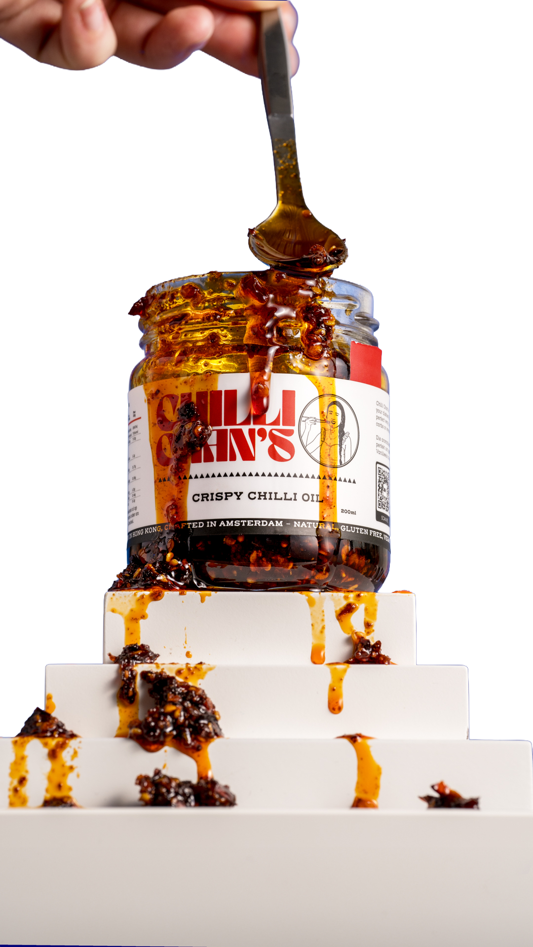
Chilli Chan'sChilli Chan’s is a rapidly growing European and UK-based Asian food startup that creates Taiwanese knife-cut noodles and crispy chilli oils. The packaging is designed to transition a street-food favourite into a premium supermarket item.
The Customer's Problems
The "Cheap Instant Ramen" Comparison: Mass-market instant noodles are heavily deep-fried in palm oil, loaded with artificial MSG powders, and sold at rock-bottom prices. As a premium craft brand, Chilli Chan's must instantly look distinct from cheap, crinkly plastic instant noodle packs.

The Wet Sauce vs. Dry Powder Confusion: Most instant brands leave consumers with salty, industrial powder seasoning sachets. Chilli Chan's packages an authentic, restaurant-grade wet sauce paste. The packaging must convey that this is a premium, restaurant-quality meal kit rather than a quick junk-food snack, and show the sauce if possible.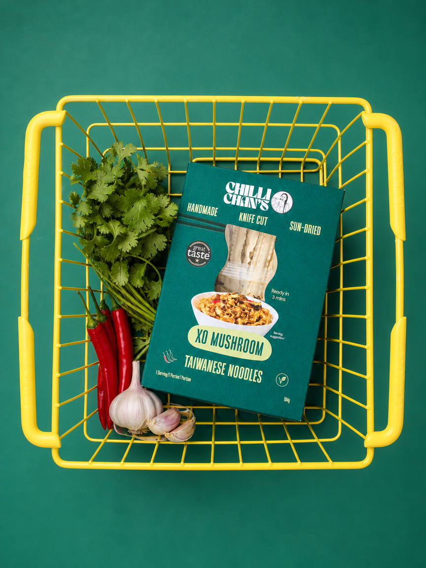
How the Design Solves Them
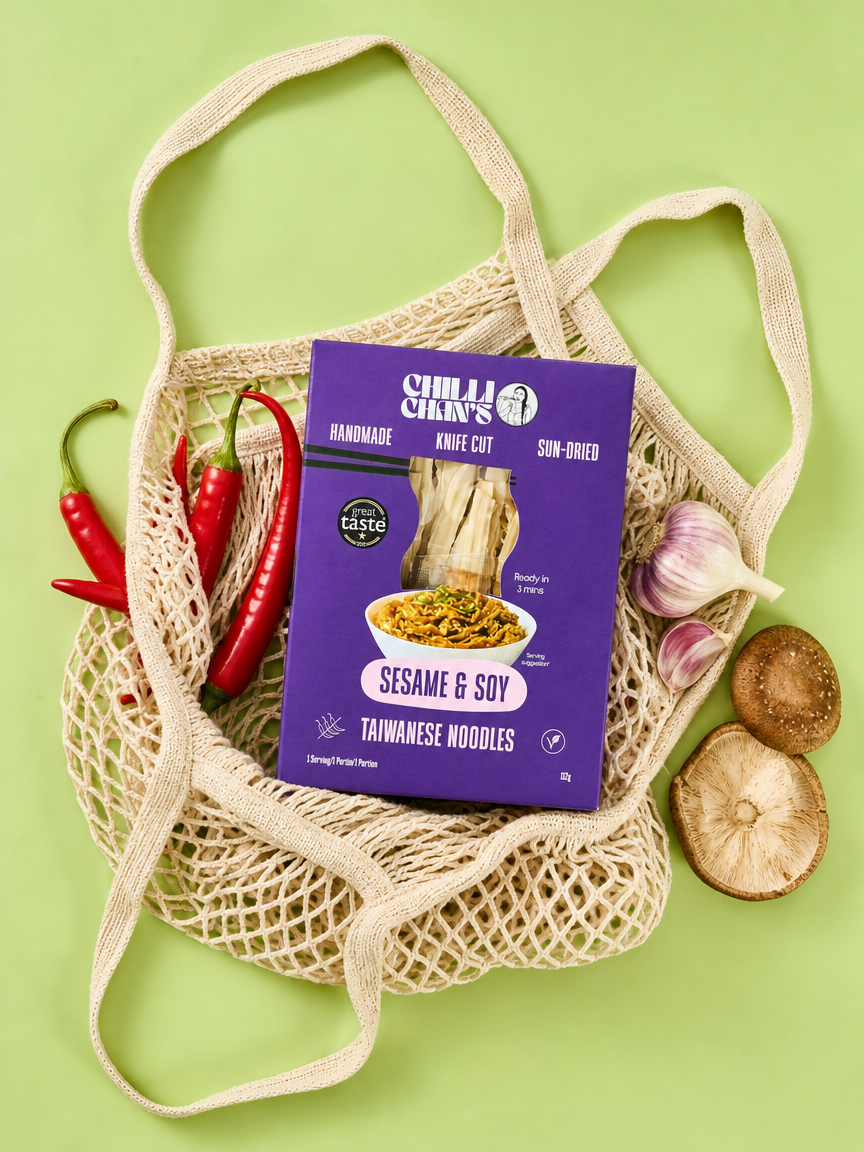
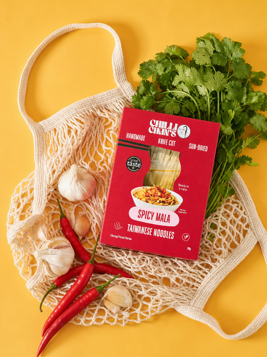
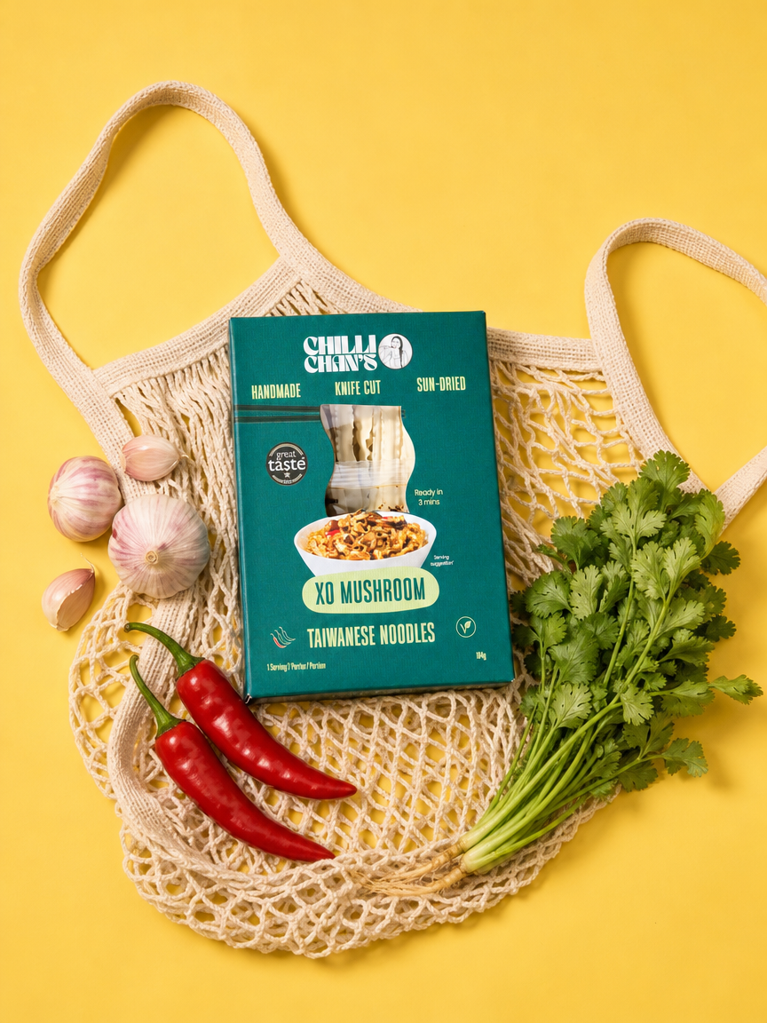
A Premium Structural Rebrand: Ditching cheap crinkly film sleeves, Chilli Chan’s packages their noodles in structured, rigid boxes with high-end bold graphic styling and novelty cut out. This box layout has successfully helped them rebrand out of independent shops and land onto major premium grocer shelves like Ocado and Albert Heijn.

Bold Visual Hierarchy for Clear Attributes: The box front loudly highlights its healthy, premium craftsmanship—stating "Handmade & Sun-Dried" to clearly separate itself from unhealthy deep-fried noodles. A prominent "Ready in 3 Min" seal ensures it keeps the convenience factor of instant ramen without the low-quality stigma.

Unmistakable Heat & Flavor Cues: The packaging relies on an eye-catching, vibrant color palette that balances modern street style with cultural heritage. The box explicitly maps out the intense flavor experience, calling out the "Spicy Mala" profile alongside clean icons to prepare the user for the authentic numbing buzz